Dear Sir/Madam
Contained within this blog you will find Research, Planning, Construction and Evaluation of three Media products: a Music Video, Advert and Digipak. The blog and it's contents were created as part of my A2 Media Coursework.
I hope you find the Blog interesting and easy to navigate.
Kind Regards,
Dan Spurway
Monday, 18 March 2013
Tuesday, 12 March 2013
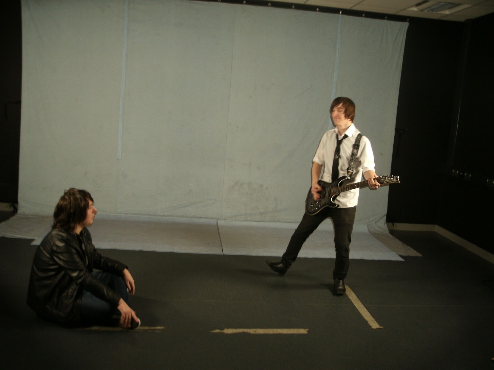
Behind The Scenes (Band)


Behind The Scenes (Jane)
This is a overview of the shots we took 'Behind the scenes' the shots below are more important and visually imposing shots. These shots were used to illustrate specific points.


This captures our co-director Dan Spurway discussing how our actress, Karen O'Leary, should act. This shot is very integral as throughout filming as we deviated from the shooting schedule, in hopes of filming more creative and intriguing shots.
Our Actress Karen fighting off the cold, as we continue filming the opening sequence. Fortuitously she found a lovely dress for the filming. As previously she did not have a dress for the first Filming session.


The shows our Actress continuing to fight the cold as we film the later sections of the song. This also shows that we used two different cameras to ensure we had enough unique and diversified footage to use for the music video.
This shows our co-director Alex Preston, expressing his excitement as we finished our last shot of the day.

This humorous image of the co-director Dan Spurway as a random bystander walks in front of his shot.

The Editing Process
Here is some Images of our chief editor, working on our rough cut.
 The image shows the software Final Cut is being used for the bulk of the editing process. We are using new iMac for editing. Lucky us.
 Another shot of the editing process, from the image you can see the number of different 'Bins' being used to organize the shots. We have 4 distinct 'Bins' Jane1, Jane2, Band 1, Band 2. This allows for more simple search for clips. And also a more simple link between the clips. As in Band 1'Bin', a shot labeled Take 1 will be the Take 1in Band 2 'Bin' but from a different angle. This reduces the continuity errors during the editing process.


Adding the Logo
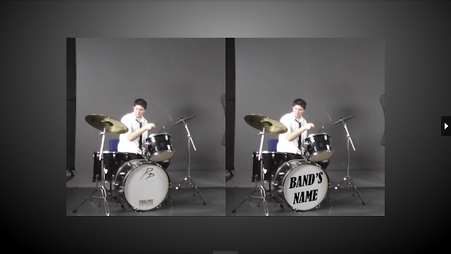
I made a interesting point at our latest team meeting. I highlighted that the majority of bands have their bands name or their logo on the instruments. The posed a problem as we had already completed our filming of the band, and lacked the time to refilm the entire band sequence. Therefore I created a work around, by placing a image on the video above. Thus rendering our refilming concerns void. Below I illustrate how I created such an affect.
To achieve this affect, I started by selecting the areas with the content we wanted to remove (i.e. the two italic P's, and the unnecessary text at the bottom). I then used the Healing Brush tool; using clean patches of the drum skin to paint over these areas. From here, I then added text on a separate layer, using a font that would resemble our chosen genre. Finally, I used the warp tool to warp the text to the angle that's related to the drum's position.
The video below showcases this to great affect.
Final Cut Tutorials
This is a basic tutorial of the use of markers, allowed our group to fully understand the use of these markers. We developed a basic understanding of the markers in conjunction with syncing audio. The video discusses many ways to use the marker. There are also many tips present in the video that can aid us in the creation of the video.
This is basic look into how to use the colour correcter tool in final cut. Our group hit a road block when trying to change to colour to of the video, the main reason for this need for colour correction was that the band were filmed on two separate days, and the lighting was not in the same place casting different shadows across the screen. With the help of this guide we changed the filter to create a video which seamlessly fitted together. They were also other small tips given to aid in our creation of our video.
This is more general guide on how to change the colour on Final Cut. But it is the small but significant tips the narrator gives throughout the video that is best help, such as rearranging the windows to make it easier to move images and video files. Or useful naming techniques to more easily find files.
This is a in depth look into transition, our group had in depth discussion on the use of transitions. This video swayed the group in favour of using them. The main reason for using transitions is a opportune way to cut between narrative strands in the music video. The different type of transitions may have a huge amount of applications within our music video. This transition tutorial allows for us to exploit all of the features available to us on Final Cut.
Wednesday, 6 March 2013
Editing Techniques

The RENDER BAR the bane in every editors existence. The render bar appears when a file is moved within the timeline, and must be 'Re-rendered' to it's new position.

This image clearly shows the benefits of using markers to synch audio, as the to different coloured markers represent the two files. The snapping feature allows for the markers to snap into place.

The timeline allows the editor to view the sound waves of the audio tracks. This in-turn allows for quick and simple synching of the audio tracks, by matching the audio-waves.

The timeline is the place where the video and audio files are placed in the order in which they are played. There are many tools present on the timeline to aid the editing process. The most prominent being the 'Lock' the lock freezes everything in that specific audio/video channel for any changes. This is imperative when working with multiple files in different channels, that the effect in one channel does not ripple into the others.


This is the marker tool, a imperative tool in the creation of the music video, as this tool allow the editor to synch video and audio seamlessly.
Our editors, Dan Spurway & Alex Preston, have created 'Bins' to organise the film clips into specific groups. Such as Jane 1, Band 1. This allows for easier searching for clips.

The green button on the left hand side of the image, allow for a video or audio file to become silent/invisible. This can be used to view a segment on a lower video channel without deleting the files above.

This tool was extremely helpful as the change opacity allowed us to create interesting affects in the video. Also the line to the right allow for the opacity to be changed throughout each specific clip.
Bloopers
This funny bloopers reel was produced quickly for the actors involved in the filming of the video as a Thank You. But from this unneeded blooper reel our group found a huge asset. The export settings, the video above is on the optimal settings. Strangely the video above was a smaller file size then the lower quality versions.
Below is Bloopers 2 - Focusing on the unforgettable Dan:
Recce Shots (Location - Band)


Recce shots of the Recording Studio
An image of the sound system present in the recording studio, this was going to be the primary way to play the song. But due to technical issues a second more up to date sound system was used.
The lights will play a imperative role in the production of the music video, as these are more suited to illuminate the band than the over head lights in the recording studio.
In addition to the better light they produce, they are also portable, allowing for more complex lighting tobe used in the music video. They are also setting on the back of the lights to increase or decrease the light they output.
 A shot of the drum kit used in the video, this allowed us to have the same equipment each shoot. They was a issue with equipment as an other subject was using the drum kit.
One is the most expensive pieces equipment in the recording studio, the 'Green Screen Cameras', we were debating using this immensely expensive pieces of equipement but ultimately decided not to as it did not fit with the image we wanted to portray the band in.


A long shot of the room in it's entirety, giving the green screen the presence it deserves. The green screen acts as a great back drop for the band. As many of the shots are framed perfectly with it.
Final Cut 1
Rough Cut 3
Rough Cut 3 was a huge step forward in comparison to the others before it. The main benefit is the length (The Whole Song). The majority of the more prominent editing, such as; lip synching, synching the instruments has been fully complete. The other cuts and transitions just need quick changes to showcase the best possible version of the video; as some of the framing involving opacity change are introduced to quickly, fade in- fade out technique will be implemented to smooth out those sections. We have also found some small continuity errors, throughout the video. We are also going to experiment with the colour correcter to change some of the band footage as some shots seem to bright and too dark.
The two editors Alex and Dan have also discussed adding a logo to the video, and after some test footage we know it works, all that is left adding to the video.
Rough Cut 2
This is our groups second rough cut, the length is only 1.40 out of 3.00. The majority of the editing is complete in the earlier sections, the later sections are not. Mainly due to extra footage that is in the process of being filmed to be added. Throughout the video we will be adding more fluid transitions between shots, utilising the fade in-fade out technique to add fluidity. Also some of the sections contain unneeded or overdone opacity changes that deter from the video. Also some of the footage is slightly out of synch, no thanks to one of our editors, Alex, all of the files moved when adding a new video track to the timeline, trying to re-synch them has taken up much of our time.
Draft Digipak 2
This is our groups 2nd draft of a Digipak. For this draft we decided to merge and/or use elements from multiple images to create the mood and feel we want for the digipak. The reason for choosing these two photos are the unique elements present in both:
Original Images

-The signpost has a symbolic connotations in the music video, adding it to the digipak will further it's symbolic effect.
-The shot of Jane (Karen O'Leary) looking upwards towards the signpost is good quality, and can be used in many different situations.

-The Sky in this photo is extremely crisp and clear cut, making it the perfect background for a Juxtaposed image, the only downside it the buildings are in the way.
- The church which is in shadow could be used, brighten the image in photoshop and use it in another context.

- The background of the image is disquieting and dark but does not posses the required framing and image quality needed for a Digipak.
Edited Images
 This image was created using elements of the second image (Above). The image has been brightened to ensure the sun is the focal point of the image. The buildings have been removed using the content aware tool. Even using this tool the image looked distorted and unnatural. To counter act this we used the colour and texture of the surrounding area, (not unlike the content aware tool) and masked the areas in the cloud.
Draft Digipak 1

Concept
This was our first try at producing a draft digipak, at this point we did not have all the photo shoots completed. So this digipak was completed using a very basic template. The underlining concept of the digipak is of a memories and remembrance. Thus the worn texture on the digipak to denote that specific concept. There was a overall feeling of Zen tranquility that was created with the digipak. The reasoning behind this was that Jane found peace in her untimely demise, and the band are searching for such calm and peace in the acceptance of her death.
Construction
To build the digipak, our marvellous digital graphics creator, Dan, will discuss how he built it with the following:
To begin, I found a digipak template, with the 6 panels marked out. From here, I used an image of old paper as the background. As the image was semi-cropped, I reconstructed the image by replicating the top of the image. Then it was a matter of creating each panel. As we decided to go with the Zen idea, I acquired visual examples of the Zen culture, which included the Zen leaf, and Zen sunshine. I cropped the lower half of the Zen sunshine, as I wanted to show the beginning of change by having a sunrise; however, some pessimistic audience may see it as a sunset representing the end of life. I then changed the colour of the Zen leaf image, by going to Image -> Adjustments -> Replace Color; and tweaking the colour (blue) to a golden/brown colour to blend better with the background. As the background of the image was of a different texture, I masked the image, removing the background in a non-constructive manner. This meant the leaf would blend better. Finally, I reduced the opacity of the image's layer so that the image wasn't intrusive to the viewer's eye. Another addition we decided to add, was a QR code. This was due to the fact that many albums feature a QR code to navigate customers to their website, or Facebook page, via their phone or portable device, assuming they have an app which will read the QR code. In regards to the front cover, I went with a font that resembled handwritting which denotes a more personal feel to the digipak. This subverts conventions of the genre, but applying David Gualett, conventions are in constant negotation, allowing us to create new and unique interpretations of the album.
Whilst creating this post our team member, Dave Waugh found a interesting copyright free image which may add to the effect created above:
Final Advert Design

This is the final overall design decided by our group. Slight changes will be present in the final version, such as Text colour change, and maybe slight movement of the photos. The advert does conform to all the conventions and subverts others. The lower section was created by our superb Photoshop Guru Dan Spurway, which clearly shows the sponsors and website details. We added this to conform to the conventions.

Digipak Experimentation Dave Waugh

Due to my skill level on Photoshop being at the beginner stage me initially struggled to adapt to it, however after reading the tutorials I managed to apply some of the common effects found on digipak’s, some of these included the light trail effect and the comic strip effect, the main effect I used for my photo was a grainy filter combined with the comic strip effect.
Test Fonts
Due to our main theme of our digipak being a diary (due to our song being Diary of Jane) we decided to look for fonts that could relate to this theme , the main fonts that we found were handwriting based fonts to resemble someone writing in the diary.
Here is some of the fonts which we looked at:

The first possible font that I chose was called 'Respective'.
we chose this due to its resemblance of very neat handwriting , we also chose it because we believed that it would give the digipak a sort of elegant feel to it.

![]()
This is an example of the alphabet in the 'Respective' font.
Here is another font we looked at :

another test font that we found that was a possible candidate for our digipak is a font called 'Wedding Nightmares'
we chose this because it once again resembled the neat handwriting theme much like the 'Respective', however this font seems a bit more menacing or less smooth, this can be used to show the mental instability of Jane showing that something is possibly getting in the way of her and maybe that something is about to change
Here is some of the fonts which we looked at:
The first possible font that I chose was called 'Respective'.
we chose this due to its resemblance of very neat handwriting , we also chose it because we believed that it would give the digipak a sort of elegant feel to it.
This is an example of the alphabet in the 'Respective' font.
Here is another font we looked at :
another test font that we found that was a possible candidate for our digipak is a font called 'Wedding Nightmares'
we chose this because it once again resembled the neat handwriting theme much like the 'Respective', however this font seems a bit more menacing or less smooth, this can be used to show the mental instability of Jane showing that something is possibly getting in the way of her and maybe that something is about to change
Subscribe to:
Comments (Atom)