This is our groups 2nd draft of a Digipak. For this draft we decided to merge and/or use elements from multiple images to create the mood and feel we want for the digipak. The reason for choosing these two photos are the unique elements present in both:
Original Images
-The signpost has a symbolic connotations in the music video, adding it to the digipak will further it's symbolic effect.
-The shot of Jane (Karen O'Leary) looking upwards towards the signpost is good quality, and can be used in many different situations.
-The Sky in this photo is extremely crisp and clear cut, making it the perfect background for a Juxtaposed image, the only downside it the buildings are in the way.
- The church which is in shadow could be used, brighten the image in photoshop and use it in another context.
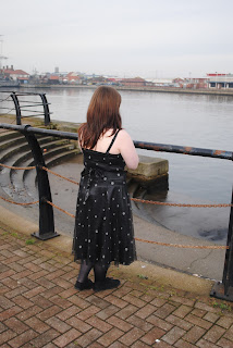
- The Image of Jane (Karen O'Leary), like the one above can be used in and out of context as her pose can represent many different emotions.
- The background of the image is disquieting and dark but does not posses the required framing and image quality needed for a Digipak.
Edited Images
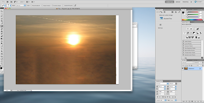
 This image was created using elements of the second image (Above). The image has been brightened to ensure the sun is the focal point of the image. The buildings have been removed using the content aware tool. Even using this tool the image looked distorted and unnatural. To counter act this we used the colour and texture of the surrounding area, (not unlike the content aware tool) and masked the areas in the cloud.
This image is taken from the two reminding images. Using the quick select tool and removing them from the orignal image. These images can now be placed into any preselect background, thus creating the desired effect.


No comments:
Post a Comment